No one pops out of the womb taking great photos. There is a little trial and error involved. And it's taken me awhile to get better at it, as well.
First, a fancy camera is nice. But not necessary. I keep a little point and shoot digital camera around the office and that is what I use. I do have a 35 mm SLR camera, not digital, but I rarely drag it out.
Mine is a Vivitar. 8 mb. I think it cost somewhere between $100 and $200. The little videos that I post are usually shot with it as well.
What is necessary is reading the manual and learning some of the different functions. If I am shooting product photos, I usually set the camera on a tripod. Either a regular tripod or a little tabletop tripod. And I usually use the timer with the tripod, as I drink too much coffee to not be all shakey, haha.
Up until recently I shot everything on Automatic, Auto, or the A setting. That should be the perfect photo, right? WRONG! And let me show you why. This photo below was shot on the A setting. The flourescent light in the ceiling is on as well.
What's that? Not bad you say? Can you take a break and go outside for recess? Keep reading. . . .
This next photo was shot on the P setting. The Program Setting. This allows one to change the white balance to flourescent light. Which is what is overhead on both of these photos. Everything else was the same, the tripod, etc.
See the difference just by changing the white balance to flourescent lighting? There is also an outdoor setting, and a tungsten setting.
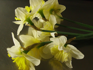
The next trick I learned almost by accident. I was not happy with my photos and was playing with the settings. And I noticed that the P setting took nice photos, when in a darkened room, with flouresent lighting coming from the room next door. Here's a photo looking into the darkened exam room with the flowers on the exam table.
And here is what that photo looks like- with the white balance set for flourescents and in the darkened room.
Getting better, huh? Can you see how much more dramatic this photo is than the first two above?
This was the photo before I edited it just a tad in photoshop. If you don't have photoshop, you can use photoshop elements, iphoto, picasa, gimp, or even picnik (flickr). I adjusted the levels a little, and upped the brightness and contrast just a touch. The final photo is below.
Want to see them side be side for comparison? See how just a little adjustment makes a better photo? It pops a little more. You can click on the images, any of them, and they should enlarge a bit.
So, that's my little photo lesson on some basic things to try with your camera. Now, apply it to your product photos. I think you'll be surprised.
Don't forget to try the macro setting if you are shooting up close, or small things, like jewelry. Also read about the aperature settings if you like those photos where part of an object is in focus and part is not. I'll show you some examples of that in an upcoming blog post soon.
So study that manual and try different settings, different lighting situations. Some people like taking photos outside, or with natural light coming through a window or doorway. As long as you get clear photos that best show your items, how you get there isn't so important. Good photos are critical to selling items online as your customers can't see items in person. Average or below average photos will get you below average sales.
Happy Photo Opportunities.


3 comments:
It brings me so much joy when I see your note cards selection at the bottom of the page and see my Friday's beautiful face looking back at me.
Sometimes I take the same shot with a bunch of different settings, just to see for myself what the difference is. I'm always amazed and always learn something. Thanks for a great post!
Too fun Andy! Hope the jewerly lady was tuned in as well!
Post a Comment